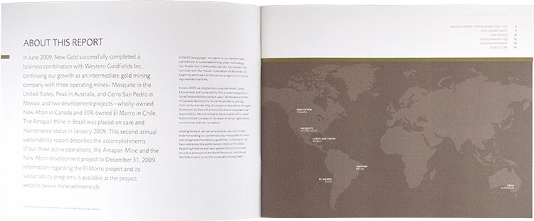
New Gold
Following the merger of three companies, a cohesive identity was required for the chosen name of “New Gold.” Our approach was to incorporate a classic reference to gold’s history with a ‘twist” to convey the company’s unique positioning. The timeless serif font in lower case is both distinguished and friendly, with a stylized drill bit graphic for sector positioning. The new identity seamlessly extended to annual and sustainability reports, tradeshow display, print and collateral. The tagline “a clear direction” was also developed to reinforce the company’s strategy of aggressive growth through acquisition.
Logo
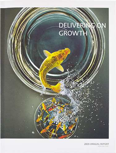
Annual Report 2009
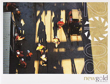
Annual Report 2008