Minefinders
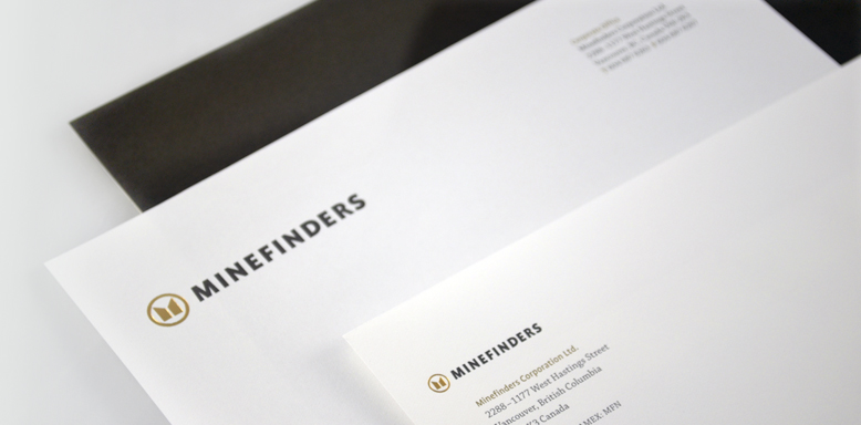
This client required a new logomark balancing both the conservative and entrepreneurial spirit of the company. We synchronized these seemingly contradictory traits with a stylized “M” to pay homage to corporate heritage, in a circular treatment to signify that Minefinders has come full circle from explorer to producer, centred in future growth. The use of upper case, heavy typography conveys overall strength and sophistication, with an earthy brown and gold palette reflective of industry positioning.
Logo

Stationary
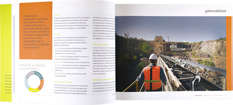
Sustainability Report 2010

Advertising